7 stunning colour trends for fall 2017
By Jo-Ann Capelaci on Sep 12, 2017
Pantone recently released its colour trends for fall 2017. For those not familiar, Pantone Inc. is a company best known for its colour matching system used originally by cosmetic companies.
Today, Pantone provides colour forecasting and is considered a universal colour language by fashion and interior designers, as well as graphic designers. I join many designers in following fashion and colour trends to keep my projects looking current.
Recently, I completed the interior design of two model homes for Pristine Homes and Bromont Homes in the charming town of Millbrook, Ontario. In one of the homes, many of Pantone’s fall colour hues are incorporated.
Look to see these colours in fashion over the next six months and notice how they will also spill over to home décor. Below, I break down some of the colour trends for fall 2017.
1) Tawny Port

Adding a splash of port in formal velvet pillows is a simple and effective way to update your room. The rich hue in velvet was also spotted on the runway this year. Shopping tip: Pillows from Elte Market.
2) Chocolate Brown

The window treatment fabric is a deep Chocolate Brown with a soft subtle texture, perfect for this eating area. Note how this hue blends beautifully with gray and black. The introduction of the red table accessories adds a pop of colour which unites the flow of the home.
3) Power Red

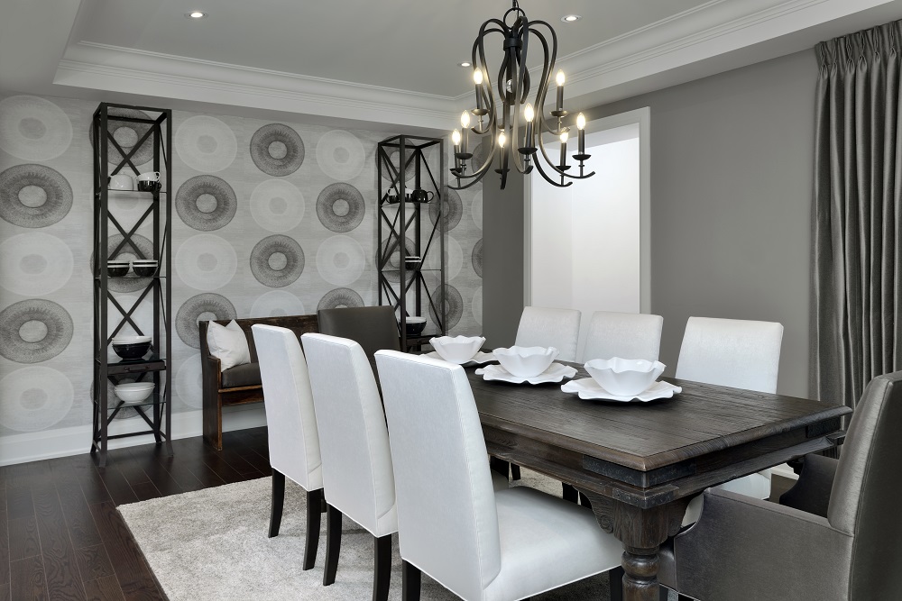
The Neutral Gray palette in the dining room is paired with white to showcase a prominent contrast. Notice the introduction of just a hint of Power Red to add interest to the space. Displaying art is an effective way to introduce accent colour. Shopping tip: Check out Lighting Interiors & More in Peterborough.
4) Grenadine

Pantone describes Grenadine as “a powerful, evocative, dynamic red. Grenadine is a confident and self-assured attention getter.” The textured Grenadine coverlet brings on a powerful expression. A hint of this same hue is repeated in the drapery and accessories to tie the look together.
Bed linens are an effective way to introduce new colour trends. If you keep the walls and floors neutral you can change your bed linens for an updated look in spring and fall. Shopping tip: Check out the coverlets at Pottery Barn.
5) Marina

Marina is the only true cool colour of fall, Pantone tells us, used to add some freshness to a room. In this Star Wars inspired bedroom we have incorporated Marina, red and Neutral Gray. One of the ways you can use these colours in your space is with paint. We painted a wide charcoal stripe to feature the bed wall. Then we had a second-hand headboard and dresser painted in our accent colours.
Add in some end tables coated in the same Power Red, improved with new knobs, and you have a trend forward, affordable bedroom design. Shopping tip: End tables from Ikea.
6) Navy Peony with Tawny Port

The combination of Pantone’s Navy Peony and Tawny Port produce a sultry bedroom design. I repurposed these chests from Urban Barn and love the way they look as night stands in the bedroom.
The Navy Peony was repeated in velvet pillows on the bed. It is paired effectively with a Tawny Port duvet cover and shams. Shopping tip: Duvet/shams from West Elm and chairs from Elte Market.
7) Neutral Gray

Gray is a perfect neutral to ground a space. The walls of this shared bath are a charcoal gray, almost black. When used with white, gray provides a sharp contrast in any space. I often use a large portion of white in bathrooms for a fresh, clean look.
Did you notice how the Neutral Gray palette was carried throughout the model home? I often select the main finishes in a home in neutrals. Then I choose accent colours in varying shades and intensities of the same hue to carry a flow throughout the home.
You can see more of this beautiful home and the other model homes I designed, in conjunction with Bromont Homes and Pristine Homes, at the Highlands of Millbrook, Millbrook, ON. See all the pictures from this model home on our Pinterest board.
Photos by Arnal Photography
Jo-Ann Capelaci is president and principal interior designer of Colours & Concepts Inc. The award winning company specializes in model homes and colour and upgrade selections for builders. They have been helping new home buyers choose finishes for their homes for over 20 years. Jo-Ann is dedicated to helping new home buyers create a model home feeling in their new home. Look for future articles on other topics to assist in decorating and designing your new home.